작품세계
Artist Statement
2019
written in 2019
내 그림에 있어서 일관된 관심은 자연과 인간에 대한 건강하고 순수한 이미지의 추구이다. 원초적인 생명력 넘치는 자연의 순수함과 일상 속의 자유로운 삶의 모습이 그것이다. 자연은 단순히 심미적 감상에 머무는 존재로 파악하기보다는 현실을 직시하고 개선해 나가는 의지를 담는 매개체로 보고자하며, 사람들의 모습에선 현실과 이상의 조화를 꿈꾼다.
자연에 대한 것은 잠자리, 과수원, 꽃, 낙엽 그리고 대지(大地)의 변화무쌍함을 즐겨 그리며, 인간에 대한 것은 일상 속에서 느끼는 삶의 단편들을 작품 속에 담는다. 창공(蒼空)을 자유로이 날아가는 잠자리에선 자연과 하나 되는 무아(無我)의 경지와 삶에 대한 철학적 의미도 생각한다. 청록으로 물든 과수원의 풋풋한 모습은 푸르다 못해 동해바다의 짙푸른 물결과 같고 때론 검은 철판과 같은 엄청난 힘마저 느껴진다. 빨갛게 익은 사과 빛은 터질 듯한 피의 물들임과 같다.
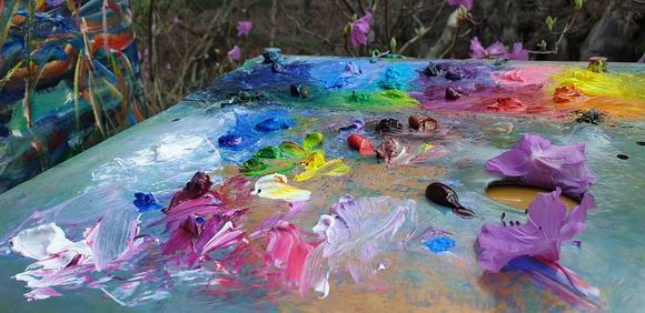
표현기법에서는 시각적 리듬감과 맛을 중요시한다.
시각적 리듬감은 붓과 나이프의 경쾌한 움직임에서 나타나는 생명력을 중요시한다. 표현 재료에 따른 것은 맛있는 음식을 먹는 것처럼 시각적 즐거움을 함께 담고자한다. 그리고 재료의 특성에 따른 인위적인 것과 우연적인 것의 어우러짐에 의한 효과에도 많은 관심을 둔다. 표현 방식상 추상적 이미지와 구상적 이미지에 대한 특별한 구분은 없다.
그 동안 나는 유채와 수채화를 즐겨 사용해 왔다. 최근엔 아크릴과 기타 혼합재료도 사용하지만 유채의 맑고 투명하면서도 끈끈한 느낌과 자유로운 마티에르에 색채와 터치의 변화무쌍함에 많은 매력을 느낀다. 그리고 그림 그리는 것 자체에 대한 즐거움도 중요시한다.
작품 속에서 나는 내 자신의 체질적인 것과 한국적인 정서가 녹아든 것에 많은 관심을 둔다. 현실적인 체험과 동시대적인 것도 잃지 않고자 한다. 전통과 미래의 접목 속에서 나와 우리의 정체성을 찾고자 한다. 그 동안 그려왔던 자연과 일상 속의 단편적인 이미지들에서 더욱 원초적 생명력 넘치는 자연의 신비로움과 순수하고도 아름다운 삶의 이상을 담고자 한다.
2000년대 초~중반부터 작품의 주된 관심사는 생명력 넘치는 바다의 사계와 매화 즉, 한국 고매의 아름다움에 대한 현대적인 탐구이다. 아울러 2018년 부터는 해외 아트투어에 많은 관심을 쏟고 있다.
My consistent interest in art making is to pursue pure and healthy images of humanity and nature: The everyday lives of people, and the purity of nature which overflows with the force of life. I think that nature is not merely a subject to be seen aesthetically but an intermediary which helps me to perceive reality truly and to improve it. I dream of people elated by the harmony between the ideal and the real.
I also think the pleasure of art making is very important. I like to draw and paint about natural phenomena such as dragonflies, fruit farms, flowers, falling leaves, and the ever-changing earth. I also like to illustrate fragments of daily life on my canvases.
When I see the flying of the dragonfly, I sense philosophical meaning and feel a selflessness. I am infused with strong energy from the fresh fruit farms colored with deep green which sometimes looks like the east sea and sometimes looks like a black iron plate. The apples pulse with a red so much like blood that I almost expect them to burst, splashing me with the stuff of life.
I think visual rhythm and taste are most important. Visual rhythm flows from the movements of brush and knife. The force of life emerges from the visual rhythm. In this regard, there's no division in technique between abstract images and the figurative images. I also have much concern about the deliberate or accidental effects arising from the specific character of painting materials. Materials are potent ingredients in the stew of a painting.
Oils and watercolors are my preferred materials. Recently, I have been using acrylic paint and other mixed media, but I find oils to be of superior clarity, transparency, adhesiveness, texture and versatility of shade and hue.
I am conscious of the ways in which the subjects of my art fit with my constitution and with a perhaps particularly Korean emotional sensibility.I try to stick to experiences from my real life and times, striving to locate my identity relative to my heritage and a positive vision of the future. I bring to this endeavor a heartfelt appreciation for mysterious nature overflowing with the force of life, and a conception of life as essentially beautiful and pure.
1, 세계 미술 투어
1, World Art Journey
본인이 해외에서 그림을 그린 것은 2002년 미국(Indiana)을 방문하면서 시작했다. 이후 2005년부터 호주(N.S.W., QLD)를 자주 방문하면서 그림의 변화를 찾기 시작했고 미국과 일본도 여러차레 방문했다.
2014 러시아, 2016 캄보디아에서도 그림을 그렸다. 그러나 당시엔 예술고등학교 미술교사로 재직하고 있었기에 충분한 시간을 확보할 수 없었다.
본격적으로 해외에서 그림을 그리기 시작한 것은 2018년 부터였다. 2018년엔 프랑스/룩셈부르크/독일 61일(4,24~6,23), 호주 56일(9,12~11,6), 미얀마 14일(11,9~23), 2019년엔 독일/룩셈부르크/프랑스 44일(4,24~6,6), 호주 44일(9,25~11,7), 중국 30일(6,19~7,18), 미얀마 30일(11/19~12/18). 즉, 현지에서 그림을 그리고 그곳에서 개인전과 워크샵을 했다. 2020년엔 유럽, 중국, 미얀마, 러시아에서 개인전과 워크샵이 계획되어 있고, 이외에도 싱가포르, 캐나다, 미국, 호주, 베트남 등에서도 작품 활동을 의논 중이다.현지에서의 작품활동은 단순 여행스케치 혹은 관광은 아니다. 즉, 현지에서 그들의 삶을 이해하면서 문화의 다양성과 새로운 작품세계를 탐구하고 현지에서 전시와 판매도 하면서 세계를 무대로 작품 활동을 하는 것이다. 이러한 폭넓은 작품 활동은 앞으로 더욱 확대/심화 할 것이다.
I started painting overseas when I visited the United States in 2002.Since 2005, she frequently visited Australia (N.S.W., QLD) and began to look for changes in the paintings, as well as the United States and Japan.I also painted in 2014 Russia and 2016 Cambodia. At that time, however, I was a full time art teacher of art high school, so I could not get enough time.It was in 2018 that I started painting overseas include solo exhibitions and workshops. France / Luxembourg / Germany 61 days, Australia 56 days, Myanmar 14 days in 2018.
Germany / Luxembourg / France 44 days, Australia 44t days, China 40 days, Myanmar 30 days in 2019. In 2020, solo exhibitions and workshops are planned in Europe, China, Russia and being discussed in Singapore, Canada, the United States, Australia.Overseas work is not just travel sketching or sightseeing. In other words, they understand their life in the local area, explore cultural diversity and new worlds of work, and perform works on the world stage while exhibiting and selling locally. I believe that this wide range of work will further expand and deepen
2, 매화梅花
2, Maehwa (Plum Blossoms)
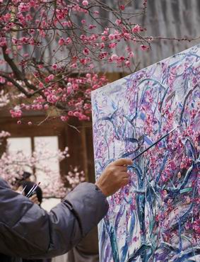
본인의 매화 그림은 단순히 시각적인 아름다움뿐만 아니라 군자(君子)의 절제된 정신세계와 한국적 정서가 담겨있다.
늦겨울~초봄, 선홍빛으로 꿈틀거리는 홍매의 꽃망울이 하나 둘 터져 나올 때부터 하늘과 땅을 꽃잎으로 수놓을 때까지 순환(循環)하는 자연의 아름다움과 삶의 윤회(輪回)에 대한 경이로움, 그리고 찬란한 생명의 환희를 그렸다.
고매(古梅) 앞에서면 숙연한 마음과 가슴 뭉클한 전율을 느낀다. 고매 나무의 뒤틀어지면서도 절제되고 자유로운 형태와 나무둥치의 썩고 거친 모습과는 대조적으로 힘차게 쭉쭉 뻗은 가지에서 핀 형용할 수 없는 고운 꽃잎을 보면 험난한 삶의 여정을 견뎌온 아련한 고향의 봄 혹은 어머니의 사랑을 연상케 한다. 그리고 꿈속 같은 고매의 향연에 빠진다. 매화(梅花)작품은 대부분 오래된 사찰(寺刹)에서 그렸는데, 계절적 감각을 살리면서 현장감과 생동감을 강조했다. 작품은 매우 속도감 있게 완성한 것도 있고, 여러 해 동안 연속하여 그린 것도 많다. 즉 주제/대상에 대한 끊임없는 탐구를 통해 작품의 깊이를 더했다.
표현기법에서 작품의 배경이미지는 아크릴을 주로 사용하여 담백하면서도 풍부한 물맛과 추상적인 분위기를 강조했고, 매화 꽃/나무는 형상(形像)을 유지하면서 유채의 장점인 마띠에르 효과를 리드미컬하게 적절히 강조하면서 수채화처럼 싱그럽고 경쾌한 맛을 살렸다. 즉, 본인의 매화시리즈는 한국의 전통 수묵화와 서양화 표현재료의 장점을 조화시킨 현대적인 방식으로 표현했다.
My Maehwa paintings reach beyond the mere aesthetic beauty of the subject, bringing to bear symbolic meaning, especially in the realm of Korea’s emotional disposition: the noble character and strong discipline of the dedicated scholar.
It is easy to imagine the tree and its beautiful flowers as symbolic of struggle and life’s perpetual soldiering on. The act of blossoming is both gentle and forceful. The petal’s delicacy contrasts to gnarled boughs and rough twisted trunks. The Maehwa stretches toward the unreachable sky with an unyielding tenacity.
The Maehwa blossom season thrills me. This glorious spectacle fills me with a sobering appreciation. Often, I spend several minutes standing in front of the tree, contemplating its beauty and the emotion it stirs. In addition to the connotations of the soldier’s spirit, the Maehwa touches me personally, reminding me of my hometown in spring. I think of my mother's love when I look at the blossom’s inconceivably graceful form.
From late winter to early spring, the flower buds struggle to burst forth in profusion, until all of heaven and earth is embroidered with leaves and flower petals! The cyclical beauty of nature, the miraculous perpetual cycle of life, and splendid joy - all are present here.
The primary setting of The Maehwa Works, the grounds of aged Buddhist temples, nurtures the senses with the savor of the changing seasons, and infuses these paintings with a lively spirituality.
Some of these works were completed in one sitting, while many of them were created over several years. Returning every year afresh to the thematic connotations of the subject has added depth of meaning along with the layers of paint.
Acrylic paint has availed for the expressive technique of rendering the painting’s backdrop, the structural integrity of the Maehwa. Thus, the figure of the tree remains intact while the oil paints are applied. Taking full advantage of both mediums, the material effect is a rhythm with attributes of watercolor in that it is merry and refreshing. So, it can be said that The Maehwa Works enact a harmonious marriage of the positive traits of disparate materials: those traditionally utilized for the painting of a Korean SooMukhwa, and the more modern materials used in Western paintings, which require their own distinct methodology.
Plum Blossoms in Winter
The works of "Plum Blossoms in Winter" forms a part of the Winter of Dragonfly Seasons Series. The Plum Blossoms has always figured prominently in the most famous Korean traditional paintings. It is one of the four "gracious plants"(along with the orchid, chrysanthemum, and bamboo). These represent the noble character of the true gentleman.
Plum Blossoms at Tongdo-Sa, which became a focus of my painting three years ago, have produced different impressions every season. I feel that the Plum Blossoms offered here convey not only the simple beauty of nature, but also a sense of mercy reminiscent of the spiritual teachings of Buddha. Observing the flower buds bursting out in scarlet even as I painted them on the canvas in oils, I experienced a great fulfillment and completeness of life.
Plum Blossoms at Tongdo-Sa became a focus of my painting since 2003,
On the doorstep of spring, I am captivated by Plum Blossoms opening on
an old tree at Tong-do Buddhist Monastery. It reminds me of a story I
heard in elementary school about a girl whose mother, as she lay dying
in mid-winter, longed to see the Plum Blossoms once more.
- In a feverish dream, the girl met the god of a mountain, who showed her Plum Blossoms blooming on a snow-covered peak. The girl brought the flower from her dream and showed it to her mother. Miraculously, the mother's health improved, and she lived on happily for many more seasons.
I will never forget my great joy when I first saw the Plum Blossoms blooming in the snow. Unfortunately, the snow soon melted away. I strove to capture the vibrancy of the Plum Blossoms in powerful strokes and tones as bright and cheerful as watercolors.
I first used the acrylics to paint the winter dragonflies with the background of a cloudless night, then rendered the Plum Blossoms generously in oils. I feel that this endeavor was quite successful, achieving a delicate balance between rich, heavy strokes of color and the light, airy beauty of space. Such celebration of open space is a long-honored tradition in Korean painting.
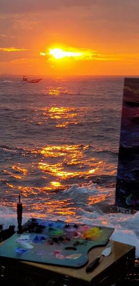
3, 바다 - 생명의 환희
3, Sea ? Vital Fantasy
본인의 바다(Sea-Vital Fantasy) 시리즈는 2005년 호주Australia를 방문하면서 시작됐다.
국내는 2010년 부산/울산에서 시작됐으며 지금은 강원도~제주도는 물론 해외로 그 범위를 넓히고 있다.
바다 시리즈는 일반적인 풍경으로서의 아름다움 보다 현장에서 느끼는 자연과 인간의 역동적이고 박진감 넘치는 모습과 삶의 기쁨과 즐거움을 그린다. 그래서 서핑/윈드서핑/일출/일몰/파도가 좋을 때면 시간과 장소를 불문하고 현장에서 캔버스를 펼친다.
본인은 작품을 시작할 때 작품구상(밑 스케치)을 치밀하게 계산해서 그리지 않는 편이다. 대신 가슴으로 느낀 감동을 머릿속으로 구상해서 그릴 때가 많다. 이것은 매우 막연하고 추상적일수도 있지만 매우 구체적이고 사실적인 경험에 근거를 두기에 그림의 방향이 분명하다.
작품 표현양식은 실경(實景)을 바탕으로 파도의 환상을 심상적/추상적/초현실적으로 표현하고자 했다. 그리고 그림의 회화적인 맛을 중요시하기에 색의 맑고 싱그러운 경쾌한 리듬감, 질감 그리고 중후한 마티에르를 강조했다. 또한 보색(반대색)대비와 원색이 돋보이지만 색이 가볍거나 덜 익은 느낌이 들지 않도록 전체적인 색의 조화에도 신경 썼다. 유화로 그렸지만 보조기름인 Liquin을 사용하면서 유동성 있는 표현과 르프랑 Lefranc(프랑스) 유화물감의 장점인 맑고 투명한 느낌을 강조했다.
앞으로 바다 시리즈는 더욱 환상적인 분위기와 현장에서 만난 다양한 사람들의 건강한 삶의 이야기를 담을 것이다.
The “Sea - Vital Fantasy” series began while visiting Australia in 2005. I took my interest of seascapes home and began expanding on the series in Busan/Ulsan by 2012. I will continue this series adding foreign locations as I get the opportunity to travel.
The work in this series is not meant to be only about beauty, it is intended to reveal a dynamic interplay between nature and human energy, perhaps the key to a joyful of life. Ultimately, it’s why I try to capture the wind, sun, and surf. It is there, where joy seems the most alive. That is also why I physically go to the place and experience it first hand. While I paint I can bask in that warmth. I don’t approach it with a detailed plan. Like the surfers I am trying to go with the flow. I’m not concerned with being too vague or abstract. I am confident that since it is coming from my actual experience, it is my expression’s truest form.
The work is a mix of reality and fantasy. The reality is I’m there looking at the waves, but in their ebb and flow I see abstraction. It’s moving, and it’s surreal, so I try to allow the expression of that.
Also, I love art. I use its language. I emphasize the rhythm of brush strokes and surface texture. I use fresh and cheerful colors. I try to convey more of how it feels than how it looks. While I employ complementary and primary color schemes, I often favor a full spectrum. It seems natural to use all the colours. I also try to utilize the liquidity/fluidity of fine art materials. I use media (Liquin) and high quality French oil paint. I want to tell my stories with vivid colours and flowing brushwork.
For me, this has indeed become a ‘vital fantasy’. I will continue to visit new shores and share with people from around the world.
4, 잠자리의 사계(四季)
4, Dragonfly Seasons
1990년대 부터 그린 자연의 단편적인 이미지 중 잠자리는 지금까지도 즐겨 그리는 소재(주제)이다. 나는 잠자리를 통해서 살아 숨쉬는 현대문명의 정제(精製)된 힘과 자연그대로의 생생한 삶과의 상징적 결합에 대해 관심을 갖고 있다.
잠자리의 구속되지 않은 자유로운 비행은 동심의 미묘한 변화 뿐만 아니라 인간의 정신과 육체의 자유로움을 메아리친다. 즉 나의 잠자리는 자연으로의 복귀와 자연적 삶에 대한 욕구를 불러일으킨다. 그곳에서 잠자리 연작은 계속된다.
이것은 제한된 인간의 끝없는 상상력 및 영혼과 정신적 공간의 신비스러움을 나타낸다.
잠자리의 포효(咆哮)하는 듯한 날개 짓은 현대문명의 거대한 힘에 의한 역동성과 대자연의 힘찬 생동감을 담고자 하는 삶의 건강함과 순수함을 나타내고자 했다.
푸른 창공을 마음껏 날아가는 잠자리는 인간의 육체적 정신적 해방을 나타내기도 하며 동심의 세계이기도 하다. 즉, 자연그대로의 모습처럼 살다가 자연 속으로 돌아가고자 하는 염원을 담은 것이다. 무수한v잠자리의 비행은 끊임없는 무아(無我)의 경지에 대한 갈구를 나타낸다. 여백의 공간은 무한한 상상의 공간이며, 우주의 신비로움이기도 하다.
My dragonflies have found expression in all seasons and many settings. The dragonfly in flight is a natural image which I have been working with since 1990s. I am interested in the dragonfly as a symbol combining the refined power and activity of modern civilization with the raw, vivid life of nature.
The unfettered flight of the dragonfly echoes human mental and physical freedom as well as the whimsical world of the child. In short, my dragonflies evoke a return to nature and an expression of the desire for living naturally.
Space, my dragonfly series, is boundless.
This represents unlimited human imagination and the mysteries of mental and spiritual space.
The dragonfly, which flies freely in blue sky, signifies human mental and physical freedom as well as the whimsical world of a child.
In short, my dragonflies invoke a return to nature and express the desire for living naturally. The space of this painting is boundless, and represents the human imagination and the mysteries of physical and mental space.
5, 사과나무
5, Apple trees
사과 과수원은 1990년 대 초부터 즐겨 그린 것으로 언제나 내 마음속의 고향이다.
그곳은 내가 어린시절 자연의 풍요로움과 신비, 그리고 삶의 순수함과 건강한 모습을 가장 인상 깊게 보았던 내 마음속의 이상향이었다. 그래서 나는 사과 과수원을 찾으면서부터 무엇과도 비교할 수 없는 편안한 휴식과 어린시절의 아름다운 추억들을 만끽할 수 있었다. 특히, 한여름에 보는 풋풋한 사과의 터질 듯한 생명력은 언제나 내 가슴을 설레게 했다.
청년기에 접어든 사과나무의 유연하고 힘찬 자태는 살아 숨쉬는 듯한 생명력 그 자체이다.
청록의 풋풋한 여름사과 나무의 짙푸른 잎들과 싱그럽게 주렁주렁 달린 푸른 사과는 동해바다의 검푸른 바다처럼 힘찬 생명력과 통쾌한 전율을 느끼게 한다. 그 순간을 지금도 잊을 수 없다. 하루 종일 맨발로 소나기 쏟아지는 듯한 땀방울 속에서 생명력 넘치는 자연을 예찬하면서 단숨에 그려나갔다. 작품속의 사과나무는 대부분 청년기에 해당된다.
최근에 그린 붉은 사과 시리즈는 수확하기 직전 대자연의 건강하고 풍성함에서 우리 삶의 활력과 여유로움 그리고 삶과 자연의 아름다움에 대한 찬사를 담고자 했다.
The apple orchard series is particularly close to my heart since early 1990s.
While not truly my boyhood home, the apple orchard reminded me of the feelings of my youth. In the orchard, I felt comfort and relaxation and enjoyed the memories of my youth. My boyhood was a time of wonder at the mysteries of nature, a time of innocence, a time of good health and happiness. Particularly, looking at summer-fresh apples, bursting with life after having survived the growing season, makes my heart stir.
In that one spot and on that one day, I felt all of life's ages, from the young supple nature of the trees, to the dark green leaves of the warm summer days, to the future abundant and refreshing fruit that the trees would bear. Looking at that painting makes me feel like summer, every day.
The scene struck me so strongly that I endured the intense heat of that summer day, ending up looking as if I had just showered. But, I was totally satisfied that I had captured the beauty of the moment.
6, 표현재료
6, A word on materials
내가 즐겨 사용하는 재료는 유채(Oils)다. 그리고 아크릴(Acrylics) 과 수채(Water color)도 함께 사용한다. 대학입학 후 그리기 시작한 유화(Oil painting) 작품을 보면 재료사용면에서 문제점을 많이 발견한다. 체계적이지 못했던 대학시절을 거울삼아 재료사용에 신경을 많이 쓰는 편이다.
현재 내가 사용하는 캔버스는 대부분 전문가용 아사천이나 반아사천을 캔버스 틀(왁구)에 씌워 제소(Gesso)를 여러 번 얇게 칠한 후 다시 유화물감 화이트(White)를 린시드(Linseed)와 페트롤(Petrol)에 적당히 용해(溶解Solution)한 것을 얇게 칠한 후 Linseed의 누런색이 우러나올 때 까지 수개월을 기다린 후 그림을 그린다.
유화물감은 80년대 후반부터 프랑스산(産) 르프랑(Lefranc) 전문가용 물감을 주로 사용해 오고 있다.
최근엔 다양한 전문가용 유화물감도 함께 사용하고 있다. (램브란트Rembrandt, 윈저&뉴튼 Winsor & Newton, 신한 Shinhan). 굳이 르프랑 전문가용 물감을 많이 사용한 이유는 다른 제품에 비해 맑고 경쾌한 효과가 잘 나타나기 때문이다. 아마 이것은 중,고등학교 시절 수채화의 투명하고 경쾌한 맛과 속도감 있는 터치의 회화성을 좋아한 내 그림스타일에다 풍부한 마티에르 효과가 더해지는 유화물감의 특성으로 적합했기 때문이다.
유화를 그릴 때 보조재로 쓰는 것은 영국(産) Winsor&Newton의 릭퀸(Liquin)이다. 여기에 Linseed(국산)나 Poppy Oil(프랑스산)를 적절히 혼합해서 사용한다. 요즘엔 주로 Liquin이나 Poppy Oil을 독립해서 유화물감과 혼합해서 그릴 때가 많다. 이런 방식은 초창기 그렸던 그림들과 비교하면 작품보존성과 표현성에서 차이가 뚜렷하다.
아크릴 물감은 영국(産) Winsor&Newton과 호주(濠洲)산 Atelier 그리고 국산 Alpha 제품을 번갈아 사용하고 있다. 아크릴은 유화처럼 보조 재료에 따라 표현효과가 다양한데 주로 풍부한 회화적인 맛을 위해서 물의 농담을 중요시하고 아크릴물감의 적절한 윤기(광택)를 위해서 Gel Medium을 사용할 때가 많다. 역시 중요하게 생각하는 것은 캔버스에 그리기 전 Gesso를 사용해서 여러 번에 걸쳐 밑바탕작업을 한 후 그림을 그린다.
수채화 그림은 특별하지는 않다. 다만 전문가 물감의 미세한 차이를 염두에 두고서 표현하고자하는 주제에 따라 화지를 여러 가지로 바꾸어 그림을 그린다. 아무래도 빛에 약한 수채화 물감자체의 한계 때문에 전시/보존에 특별한 신경을 쓰는 편이다.
I prefer to use oils. I have also used acrylics and watercolors. There were some problems with acquiring proper materials in my university days. In light of that past experience, I pay extra attention to the materials I use.
I generally use framed linen canvas that has been seasoned for several months, until the yellowish color of linseed emerges after several thin applications of Gesso, followed by a mixture of white oils, linseed and petrol.
I have mainly used Lefranc oils since the end of 1980s. I find that this line of paint expresses a clear and bright effect compared to other brands. Its matiere effect seems suitable for my painting style, which pursues the transparent and cheerful touch of watercolors in oil paintings.
Thesedys I am using together with the professional Oil colors of Rembrandt(Netherlands), Winsor & Newton(England) and Shinhan(Korean).
As a medium, I use a mixture of English-made Winsor & Newton Liquin and Korean-made linseed or French-made poppy oil. Recently, I have attempted to use Liquin or poppy oil independently as medium. This medium allows distinct preservation and expression compared to my early works.
When working with acrylics, I commonly use the English-made Winsor & Newton, Australian-made Altelier or Korean-made Alpha brands. As with oils, the effect of acrylics varies depending on the medium. The fine effect of light and shade is a key of acrylics. The gel medium is often used to give luster to the acrylics. I also prefer a canvas on which the Gesso is applied several times.
Considering the delicate difference among watercolors, I use a variety of papers according to the motif and subject. I pay much attention to processes of display and storage, because watercolors are very vulnerable to light.